As record heat waves sweep across India’s major cities, a new generation of urban heat action plans is showing why granular, location-specific data is critical, and how geographic information systems (GIS), AI, and remote sensing can help protect the most vulnerable.
In Delhi, for example, temperatures recently soared beyond 45°C (113°F). For informal workers like waste pickers, who sort recyclables outside in the blazing sun, there is no break. With each passing summer, heat-related illnesses and deaths are on the rise. And yet, most city-level heat action plans remain too broad to deliver help where it’s needed most.
To tackle this gap, research groups and nonprofits are now turning to a smarter combination of satellite imagery, local data, and AI models to pinpoint heat vulnerability block by block, and even building by building. One nonprofit, SEEDS, partnered with Microsoft to develop an AI model called Sunny Lives that analyzes roof types, building materials, and indoor temperatures. Combined with satellite imagery, it can estimate indoor heat exposure for individual structures, even without deploying physical sensors at every site.
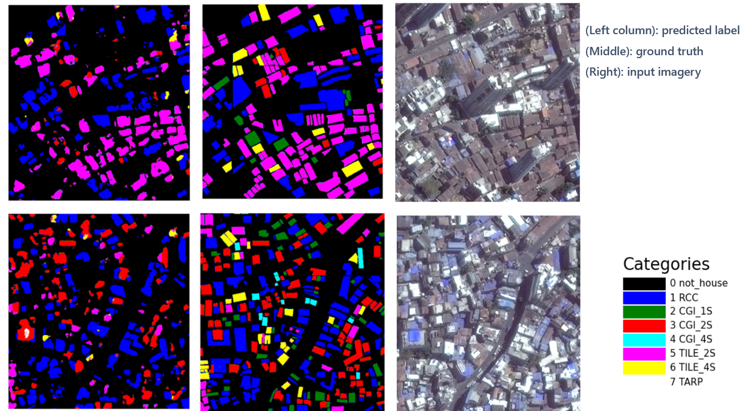
This kind of hyperlocal mapping is critical because heat risk isn’t uniform. A tin-roofed home in a low-income settlement can be 6°C hotter than a concrete house next door. Land use, construction density, green cover, and airflow all shape how heat is absorbed and trapped at the micro scale. Researchers in Bengaluru found land surface temperature differences of up to 9°C within just a two-square-kilometer ward.
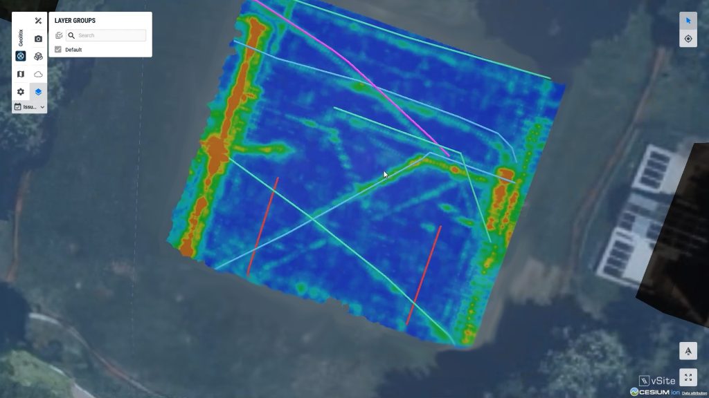
But more data alone isn’t enough; it needs to be accessible, clear, and actionable for the people making on-the-ground decisions. That’s where immersive GIS and 3D visualization come in. Our platform is designed to display complex spatial information like this. By combining high-resolution satellite imagery, AI models, and augmented reality (AR), we make it possible to turn hidden insights, whether it’s underground infrastructure or potential heat risk zones, into information people can see and trust.
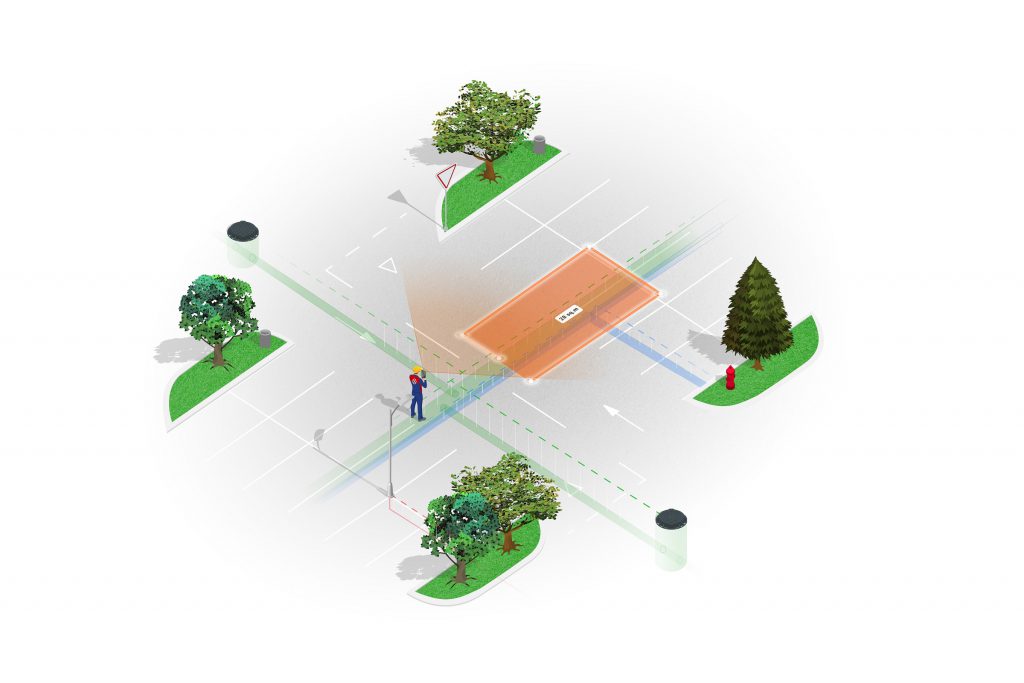
Imagine municipal planners, utility crews, or community groups using AR to see color-coded risk zones overlaid onto their neighborhoods, street by street and building by building. Instead of generic advisories, they could make real-time, location-specific decisions: shifting work hours, deploying temporary shelters, or targeting green infrastructure investments exactly where they’ll have the most impact. While vGIS is not yet used for urban heat mapping, this is the kind of innovative use case our system could support, and we’d love to see it.
This approach isn’t limited to heat. The same technology applies to flood risk, air quality, and other urban hazards. As cities adapt to a changing climate, hyperlocal mapping paired with clear, context-rich visualization empowers communities to respond faster, reduce risk, and allocate resources more effectively.
By combining the best of GIS, AI, and AR, we can help move resilience planning from static reports to dynamic, real-world action. At vGIS, we’re proud to build solutions that turn complex data into clear, spatially accurate insights, ensuring that everyone, from city officials to local workers, can see what’s at stake and act with confidence.